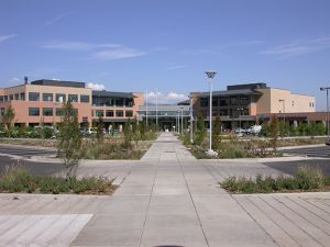
The hospital environment both fascinates and excites me.
It’s no wonder my chosen profession is as a user experience consultant specializing in healthcare. In order to help our clients create products and processes used in hospitals, it’s imperative we have a rich understanding of the hospital environment and user groups. It may be surprising to some, but the user groups (the people who interact with the products or processes we touch) in a hospital environment are widespread and can include clinical staff, other healthcare workers, patients and even family members and caregivers. As such, we’re always eager to talk to healthcare users and learn everything we can about the unique demands of the hospital use environment. So, when we were recently offered a tour of the Boulder Community Health Foothills Hospital, our team jumped at the chance.
While Foothills Hospital does not have an innovation center or employ human-centered designers, we couldn’t help but notice several innovative design elements that clearly made an impact on the clinical staff, healthcare staff, patients and families.
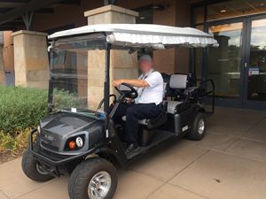
The first thing you notice when you visit Foothills Hospital, is that it has a parking problem. The hospital is part of a medical complex that includes the Anderson Medical Center, Rocky Mountain Cancer Center, and the Tebo Family Medical Building. Despite the large parking garage on premise and the availability of free valet parking, it’s common for visitors to resort to parking in the satellite parking lot, sometimes a good distance from their destination. While the extra walk is tolerated by many, it is difficult or prohibitive to some. In these cases, it’s the free Parking Taxi to the rescue! The friendly driver is constantly on the lookout for anyone needing assistance to or from their car. It’s a clever solution to the parking problem and demonstrates the hospital’s commitment to excellent service from the first moment of interaction with their facility.

The first stop of our tour was the cafeteria. We enjoyed a delicious, fresh salad from the ample salad bar. As I was dishing up a pre-made Kale salad, I was told that the kale in the salad had been grown on the hospital’s rooftop garden. On-site vegetable gardens are very popular in Boulder elementary schools and I can’t think of a better next step than to bring gardens to hospitals and other healthcare facilities. The increased nutrition the locally grown food provides for visitors and staff increases health to a population who can most benefit from it. It was clear the Foothills Community felt pride in their garden and enjoyed its bounty.
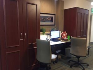
As we were walking down one of the patient floors, I couldn’t help but notice that it didn’t feel like a typical hospital wing – it felt more like I was in a nice hotel! What struck me most was the nurse station design. Typical nurse stations are large hubs centered under florescent lights and surrounded by high counter tops separating visitors and patients from the clinical staff. At Foothills Hospital, however, there were several smaller nurse workstations scattered along the hallway. The mahogany wood and warm lighting gave the feel of a cozy library or study. The result was an inviting, intimate atmosphere, rather than one of separation.
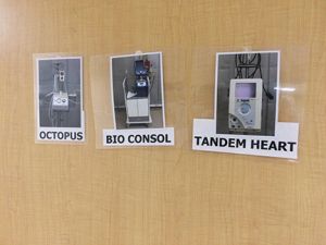
Supporting a high volume of diverse surgical procedures demands a lot of equipment and supplies. Two challenges we hear repeatedly from OR nurses and staff in user testing sessions are:
- It is difficult to stay current on the constantly-changing and abundant equipment. To make matters worse, medical device manufacturers are notorious for leaving off helpful identification labeling. While you will always find brand and model information on devices, it is unlikely the device will also tell you what type of device it is (e.g., electrosurgical generator) or what it does (cut and coagulate). Consider how challenging it must be for traveling OR nurses who only stay in one facility for a few months at a time and are constantly expected to work with unfamiliar equipment!
- Locating equipment shared between OR suites can be a time-consuming and frustrating process. Many facilities struggle to maintain a reliable system for tracking the location of all devices at any given moment in time. This is especially an issue during a procedure when a nurse is sent to find an unexpected, but necessary piece of equipment. In moments like these, it’s crucial to locate the desired equipment as quickly as possible.
At Foothills Hospital, we saw a low tech, but effective solution to these challenges. Signs and photographs lined the hallways showing staff where to place equipment in between procedures. While the intent of the signs was presumably to guide equipment placement, they surely had the added benefit of also serving as educational tools.
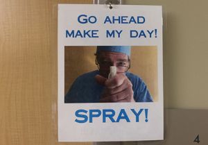
The OR had recently implemented a new blood cleaning protocol involving the use of a spray disinfectant. In order to remind staff to adhere to the new protocol, friendly reminders were hung around the OR suite. Cognitive studies show that pairing images with textual instructions increases understanding and retention. So, it’s likely that adoption of the new protocol is better with the current signs that include text and images than it would be if signs without images were hung. Also, the fun signs were a great reminder that rules and protocols are important, but don’t need to be serious. Fun can be had even in extreme life-and-death work places.
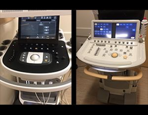
While we were walking through the imaging department, we noticed two mobile ultrasound devices in the hallway. We were told that the hospital was in the process of deciding which model to purchase. The two devices were both out so that the staff could try both and provide feedback. We were delighted to hear this! For years we’ve been educating healthcare institutions about the benefits of including usability testing in the procurement process. Selecting an efficient, usable device can be far more important than purchase price which is all too commonly the leading factor in purchase decisions. An efficient, usable device can increase user satisfaction, increase safety, and save time – all of which can ultimately save money. While Foothills Hospital is not formally gathering user feedback through side-by-side A/B testing, gathering informal user feedback is an excellent start.
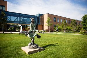
In conclusion, we were impressed with the design and process details we saw in place at Foothills Hospital – we couldn’t help but notice and appreciate them on our tour. What might seem like “little touches” such as a parking taxi, on-site garden and approachable nurse stations, were actually efforts that can have a significant positive impact on the patient and visitor experience with the hospital. Furthermore, simple inexpensive signs posted as staff reminders can increase efficiency, educate, and promote a sense of community and fun.
It’s doubtful that any of the things we noticed were implemented by someone who felt they were practicing human-centered design. Yet, they had a positive impact on the hospital environment. Human-centered design, when applied consciously and proactively can make huge impacts on patient safety and comfort, family / caregiver support, and on healthcare worker efficiency and satisfaction.
We look forward to our next visit to Foothills Hospital during which I’m certain we’ll notice even more signs of positive human-centered design.


